Hey Boss, Can I UX?
Website Usability Study & Redesign
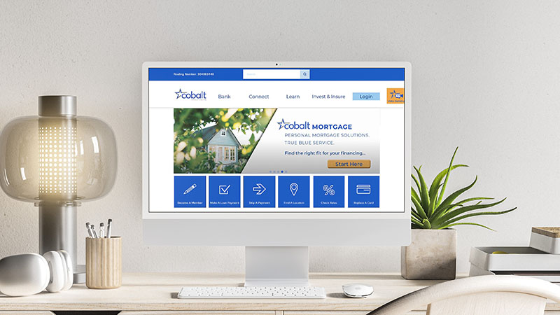
Address growing concerns about usability issues on Cobalt Credit Union’s website by conducting a usability study, analyzing findings, and applying those insights to revised designs in critical areas.
What this says about me...
- Self-starter who initiates projects
- Data-driven problem solver
- Dedicated to process improvement
- Motivated to learn new skills to accomplish complex tasks
- Innovates new ways to overcome obstacles
Role
UX & Visual Design Lead
Team
3 Marketing Professionals | 4 HR Professionals | Web Developers from partner agency
Tools
Hot Jar | Google Analytics | Google Tag Manager | Adobe Illustrator
Overview
In 2020, during the height of the COVID pandemic, I was working as the in-house graphic and web designer for Cobalt Credit Union. As such, I often received questions and feedback about the website. It became clear that there were some existing usability issues. So, I did some reading and watched some videos about how to do a usability study and submitted a proposal, gaining approval to begin the project.
This is how we do it
discover
Research
Understand
Empathize
define
Problem
Goals
Market Position
design
Ideate
Prototype & Test
Iterate
— discover —
User Research Summary
Initial research into user experience focused on reviewing Google Analytics to assess user flow, page visits, and Google Tag Manager to review tracked events. HotJar heat maps were run on the 12 main content pages of the website. Competitor sites and other industry sites were audited to better understand how information is commonly delivered. Finally, feedback from internal users was solicited and volunteered.
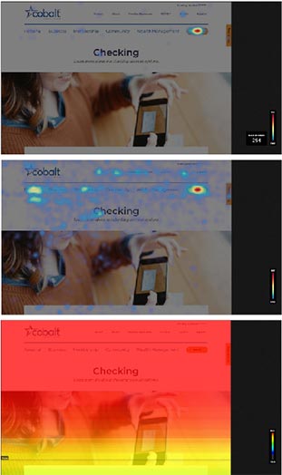
Usability Testing
Due to the constraints of the global pandemic, we needed an accessible set of participants for the usability study. I approached the VP of HR to about taking some time in their onboarding class to request usability feedback from new hires – interested in the credit union, but not necessarily familiar with the site.
To determine how users intereacted with the site navigation, participants were given four tasks to complete in a [modified] moderated usabilitu study. They were also asked five questions at the end of the session for more direct feedback.
Navigation is too complicated
Calls to action were not evident
Tables were too long and complex
— define —
Goal Statement
Improve user experience on the site by evaluating the findings from user research and the usability study to find focus items which will have the greatest impact. Design new experiences and work with the partner agency to have them inplemented.
Focus Areas
Simplify navigation layout and language
Stronger calls to action placement and language
Redesign tables and accordions for clearer communication
— design —
Navigation Menu
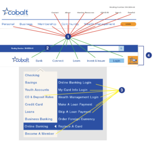
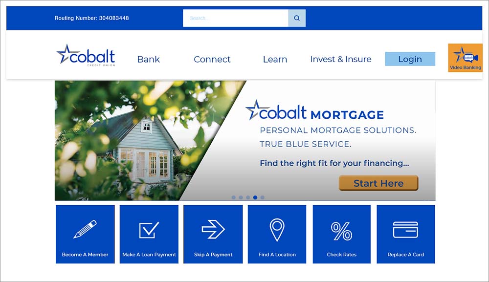
Changing the structure of the mavigation to present fewer top level options and allowing users to filter to their desired destination via drop down menus reduced the overwhelming number of choices at any given level.
- Fewer top level navigation options
- Search bar in the navigation
- Including mevigation for priority links that formerly only existed on the login/apply links page
- Sticky navigation allows for easy access to the site at any point on any page
Online Banking Login
The login button navigated users to a bage full of links, causing confusion about which link to choose to login to online banking. Changing the login button to link directly to the online banking platform streamlined the process, eliminating the confusing links page.
- Login links directly to online banking
- Other links on the login/apply page moved into the “bank” dropdown menu
- Links renamed to better reflect the destination page
Content Audit
Content across the site was inconsistently written and displayed, creasing a disjoined user experience. In some cases it was not clear when users had navigated away from the site.
Editing content to use a consistent voice and be formatted in a consistent way allowed users more confidence in both navigating and understanding the content.
- Reduced hero images to allow more content above the fold
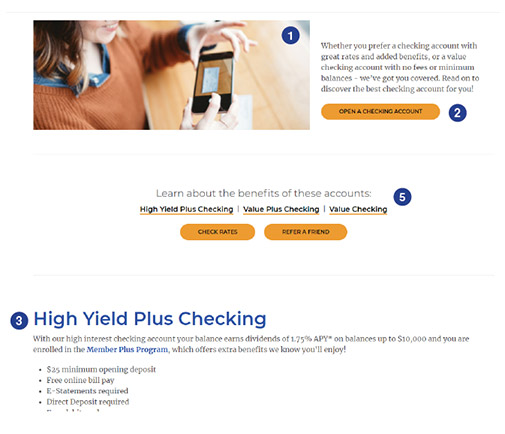
- Clear and consistent calls to action guide users to quick conversions
- Formatting content for scanning and linking to longer content allows efficient browsing
- Combining pages with related information to reduce the number of clicks to reach the desired destination
- Anchor tags to allow quick jumps through page content
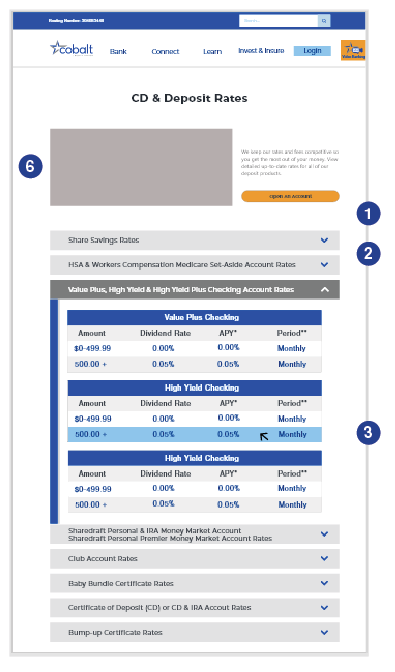
Other Considerations
Some styling was getting in the way of users accessing or understanding content. Excessive padding caused long scrolling between items. Unweildy tables made information dense and unapproachable.
Editing the styling on and between troublesome elements made navigating and understanding information easier for users.
- Reduced padding trucated the scroll
- Accordian menus broke up heavy text and table sets
- Hover highlights ensured tables were easy to understand
- Blog images made scanning for articles quicker
- Blog read time allowed users more information when deciding to read an article
- Implementing responsive images decreased mobile site load times.
— reflect —
Impact
Within days of the changes going live, I received unsolicited feedback from several credit union branch employees describing how much better they felt the website was performing. Some even expressed having heard the same feedback from customers.
What I learned
This was my first foray into user experience design. Armed with the knowledge I gleaned from just a few online tutorials, I forged ahead. The process taught me a lot about how to plan and implement testing, and a lot about how not to do the same! While I am proud that I found a way to do the testing, it was apparent that there was not the degree of control that makes studies scientific. Nevertheless, insights were had and changes were made.
If I were to go back, I would like to have set out some indicators that I would follow up on in a designated amount of time in order to determine the effects of the changes. Had I stayed on at Cobalt, I would have tried to keep doing testing and iterating on the site.
What's on your mind?
Improve this site:
Share your experience as you interacted with this site.
Your feedback is critical to making impactful changes.
Collaborate:
New challenges welcome!
Tell me about how you want to work together.
