UX Process End-To-End
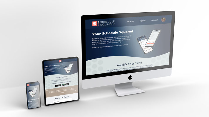
Mobile App & Responsive Website
Google/Coursera User Experience Design Professional Certificate course project showcasing comprehensive knowledge of the UX design process and associated deliverables.
What this says about me...
- Certified in UX Design by a reputable course provider
- Interested in ongoing professional development
- Knowledgeable of the end-to-end UX design process (while acknowledging that real-world scenarios are rarely so straightforward)
- Capable of producing appropriate industry standard deliverables for each stage of the UX design process
- Experienced in industry-standard software
- Skilled at designing mobile apps and responsive websites
Role
UX Design Lead | Student
Team
Course Instructors | Peers
Tools
Figma | Google Suite | Notion
Overview
While enrolled in the Google/Coursera UX Design Certification program, this prompt-based project required the students to create an app and associated responsive website. The primary goal of this project was to learn the basics of user experience design by following along with the course material and creating a user experience to showcase appropriate knowledge and abilities.
This is how we do it
discover
Research
Understand
Empathize
define
Problem
Goals
Market Position
design
Ideate
Prototype & Test
Iterate
— discover —
User Research Summary
User research for this academic project was based on sample profiles provided in the course. Reviewing each sample, I chose to focus on two that mentioned having children and busy schedules as they fit the target audience who might use a scheduling application. I applied some imagination in thinking about how these individuals might have answered the interview questions that I had prepared.
Personas
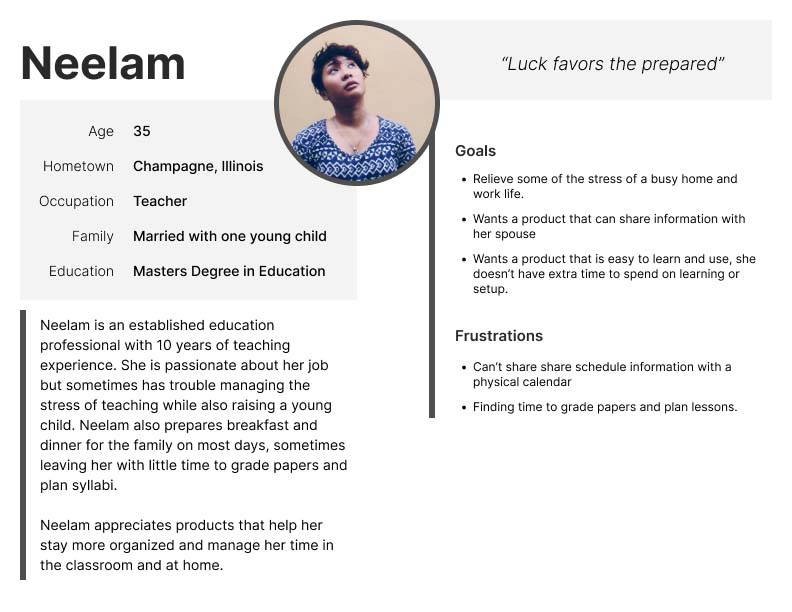
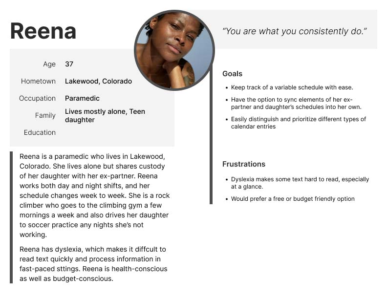
Personas were developed using example profiles provided in the course materials with some expansion based on how I imagined that each user would answer the interview questions I had developed.
Journey Maps
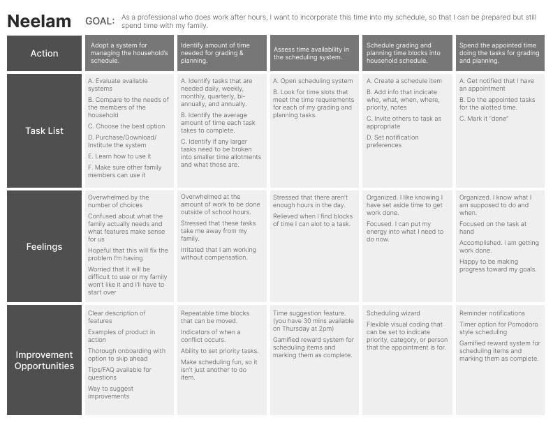
The user journey maps focus on the users path toward discovery and adoption of the scheduling app.

User Stories
Neelam As a professional who does work after hours, I want to incorporate this time into my schedule, so that I can be prepared but still spend time with my family.
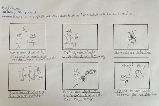
Reena As a co-parent, I want to coordinate schedules with my ex and my daughter, so that I can take an active role in my child’s life.
— define —
Pain Points
Maintaining Work-Life Balance
Finding adequate time to spend on both work activities and personal ones can be challenging, especially when there are more than one person’s time to coordinate.
Communicating Schedule Changes
Plans change, but people do not always remember to communicate those changes to everyone who needs to know. This can cause strife and interpersonal tension.
Managing Complex Schedules
It can be very hard to make sure that every member of a busy household gets to the places they need to be, on time, and prepared.
Deconflicting Schedules
When more than one event is scheduled at the same time, how does one know what to prioritize? How can schedules be managed to prevent double-booking?
Problem & Hypothesis Statements
— Neelam —
Problem:
Neelam is a professional who does additional work outside of business hours who needs to set aside work and family time because both are important to her.
Hypothesis:
If Neelam uses a scheduling app to designate work and family time she will achieve a greater work/life balance.
— Reena —
Problem:
Reena is a co-parent with a variable work schedule who needs to share schedule changes in real time because she wants to be actively involved in her child’s life.
Hypothesis:
If Reena uses the scheduling app then she will be able to coordinate with her co-parent and child and be available for important events.
Competitive Audit
Competitive Audit Goals
Learn about the offering scope and purchasing experience of family scheduling apps on the market.
Who are your key competitors?
- Cozi Family Organizer – shared family calendar and lists
- Time Tree – shared calendar and organizer
- FamCal – shared calendar and organizer
- Family Wall – shared calendar and organizer
- Orgo – shared calendar family logistics planner “organization on the go”
What are the type ad quality of competitors products?
- Cozi Family Organizer looks like a well designed app with a browser version. It reached beyond scheduling to include shopping and to do lists ad a recipe box. It touts it’s color coding but may be missing out in visual accessibility by relying on color alone.
- Time Tree is a shared schedule app that also has a browser version. It attempts to reach multiple audiences – families, couples, and business scheduling. It’s usability is unclear. The browser link to start a free calendar is broken.
- FamCal also claims to do many things such as combine calendars, events, tasks, and notes. It seems to do each at a very minimal level. No website is listed to support this product. But is has great reviews. It’s branding is a bit incoherent and it’s hard to tell what the interface really looks like.
- Family Wall is another multi-functional planner which includes a shared calendar, shopping and task lists, recipes, messaging, gallery, and contact. Branding is clear, but seems to speak to families with very young children and may not appeal to more mature parents/families.
- Orgo is primarily focused on family scheduling and logistics and is the most focused of the competitors. They have a clear interface that uses both color and images to identify people. However, if you don’t look closely at the images you might not choose to download this app. The description is vague and the images have distracting background graphics.
How fo competitors position themselves in the market?
- Cozi Family Organizer positions themselves as a must have app for families. Simple way to organize family life.
- Time Tree tries to appeal to everyone – families, couples, work groups
- FamCal positions themselves as a connection maker for families.
- Family Wall – “Game Change for Families” “Helping families with their daily organization and communication”
- Orgo positions themselves as a logistics organizer. Applying business savvy to family life.
Competitors Strengths
- Cozi Family Organizer strengths include:
- clean, simple, calm interface
- lots of social proof
- blog
- Time Tree strengths include:
- Lots of good reviews
- FamCal strengths include:
- Exportable schedule
- Calendar and agenda views
- Family Wall strengths include:
- Focus on privacy and security
- Clear navigation and interface
- Great social proof
- Integration with Google calendar and home screen widgets
- Orgo’s strengths include:
- Focused on getting one thing done well
- Scheduling/logistics
- Well designed interface
- Simple but clear branding
- Positive/friendly feedback notifications
Competitors Weaknesses
- Cozi Family Organizer weaknesses include:
- Too many services may put off some users who only want the app to do one thing well.
- May be accessibility issues with an organization app that relies heavily on color coding
- Time Tree weaknesses include:
- Too many services may put off some users who only want the app to do one thing well.
- Doesn’t really show the interface on the app store or the website
- FamCal weaknesses include:
- Too many services may put off some users who only want the app to do one thing well.
- Accessibility
- Fails to make an emotional connection or explain the benefits of the product
- Family Wall weaknesses include:
- Too many services may put off some users who only want the app to do one thing well.
- Orgo’s weaknesses include:
- Sales language and graphics are not compelling, don’t list benefits to the user
- Doesn’t show if a person plans to attend, if they aren’t designated as the attendee or driver
Gaps
Some gaps we identified include:
- Accessibility isn’t commonly addressed
Opportunities
Some opportunities we identified include:
- Time block scheduling
- Adding tentative items
Goal Statement
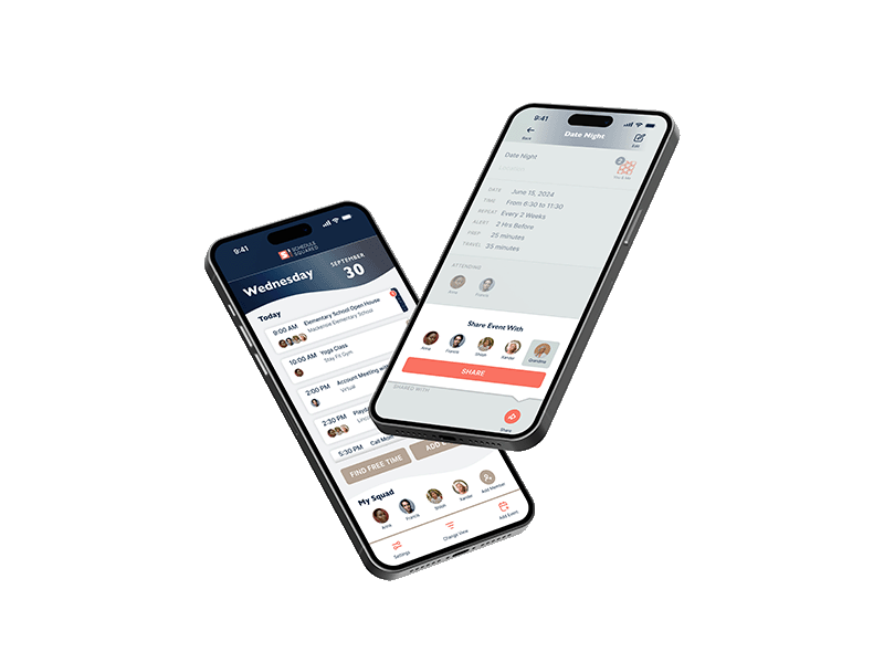
Our household scheduling app will let users create, prioritize, and share their household schedules which will affect how busy parents manage their time by giving them control over the visibility and communication of their schedules. We will measure the effectiveness by analyzing entries scheduled and entries shared.

Value Proposition
- Clear and simple, schedule focused tool.
- Keep users in control through sharing and permission settings.
- Customizable categorization to highlight what is important to the user.
- Keep priorities straight with variable views, alerts, notifications, and more data prompts.
- Be prepared for your next appointment by adding necessary information to schedule entries.
— design —
Ideation
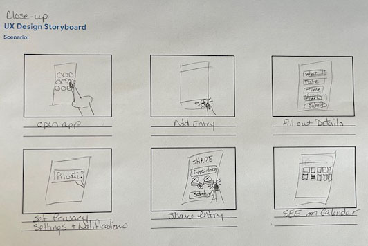
Big Picture and Close Up storyboards help to put the user into the story.
 .
. 
User Flow
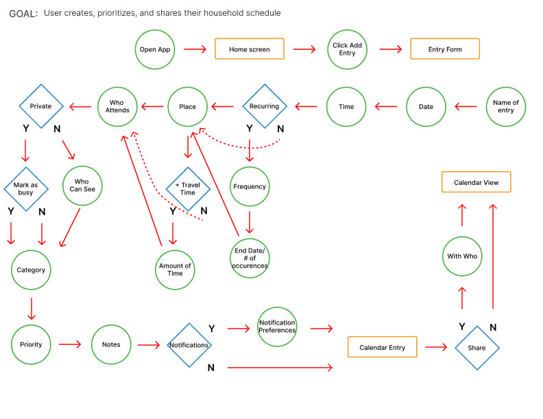
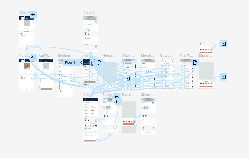
Here is the main user flow for the mobile app.
Information Architecture | Sitemap
Information Architecture for the mobile app:
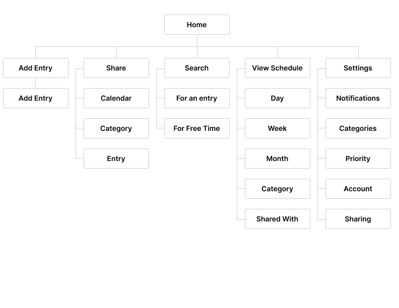
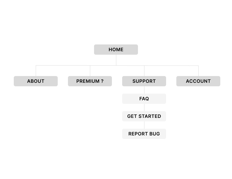
And the sitemap for the responsive website:
Paper Wireframes
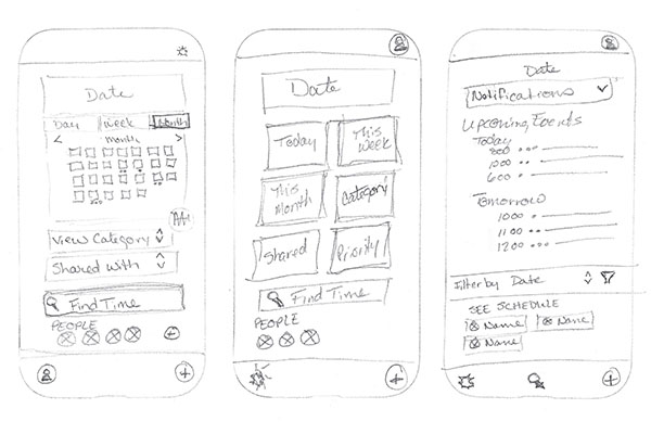
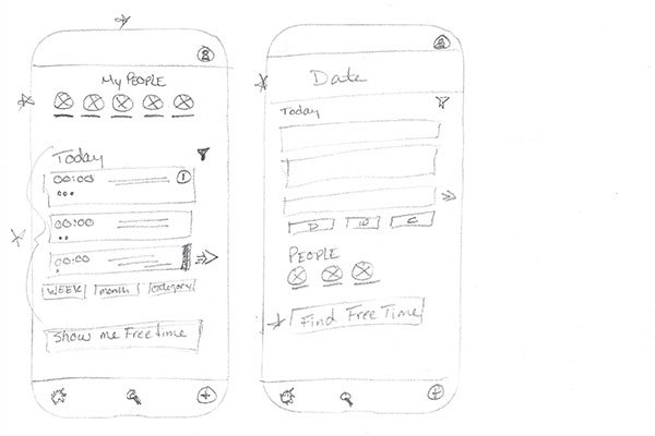
Rapid iteration on paper let me explore many ideas quickly. Those elements that seemed like the best fit made it into the initial digital wireframes. While the home screen view takes many ideas from a single sketch, other sketches were used to inform alternate views in the user flow. Below are some sketches for the mobile app home screen:
Digital Wireframes
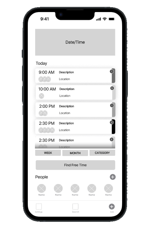
Objective: Quick access to your schedule and the people you share it with. Each listing includes details like description, location, time, people attending, and a category and priority indicator. The Find Free Time button allows users to see a different view.
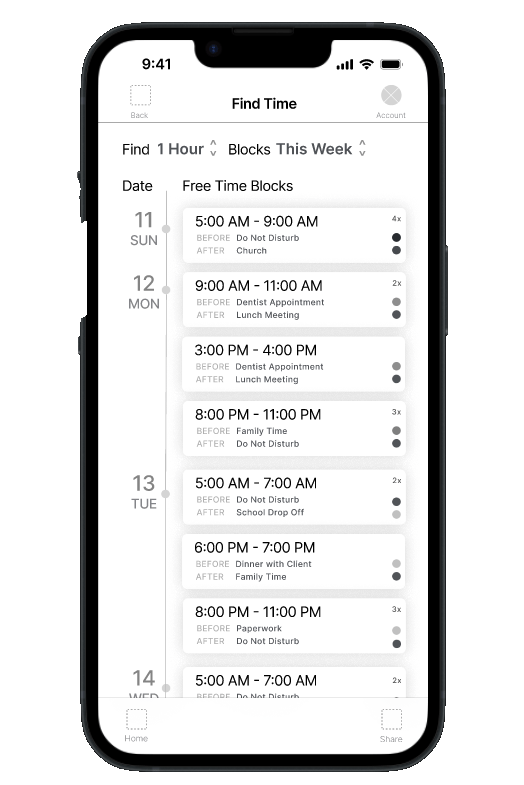
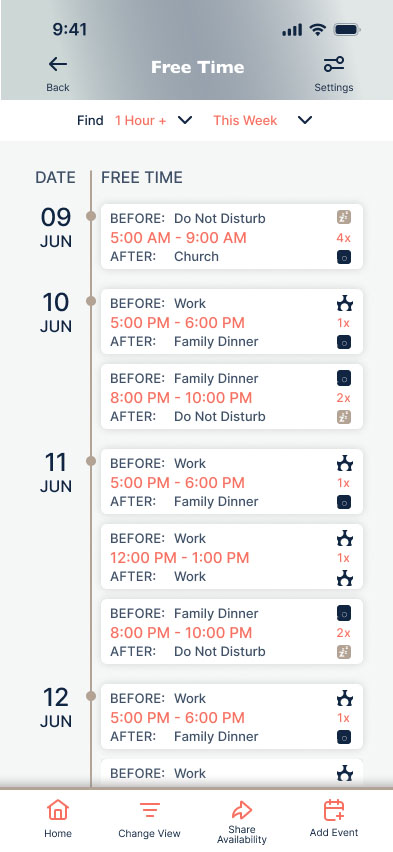
Objective: Make finding time to schedule an event as easy as possible. Each time block indicates what is scheduled before and after the block and has an #x indicator if the block exceeds the requested amount of time.
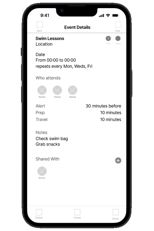
Objective: Share events with whomever you want. Access to share function lives right inside the event, and is auto populated with individuals users share with most.
Low-fidelity Prototype
During the low-fidelity prototyping phase, I identified several pages that I hadn’t previously made wireframes for. This step helped me to really understand what screens were going to be needed to round out the user flow.
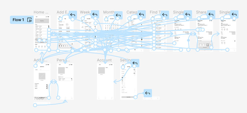
Usability Testing
An unmoderated usability test, gaining feedback from course peers provided the initial feedback for this prototype. It was not ideal considering none of the participants matched with the target audience. However, after synthesizing and analyzing the feedback from the low-fidelity usability study, the following findings stood out:
Difficult to read text
Hard to click buttons
General approval of the app concept and core funtionality
Mockups
The screens below are representative of initial mockups prior to high-fidelity prototyping and usability testing.
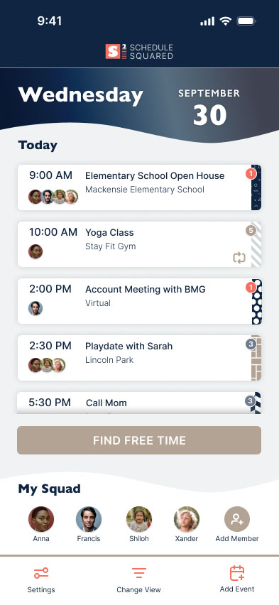
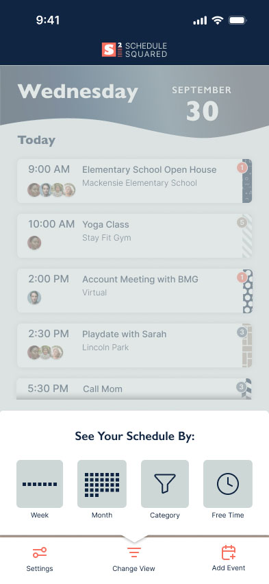
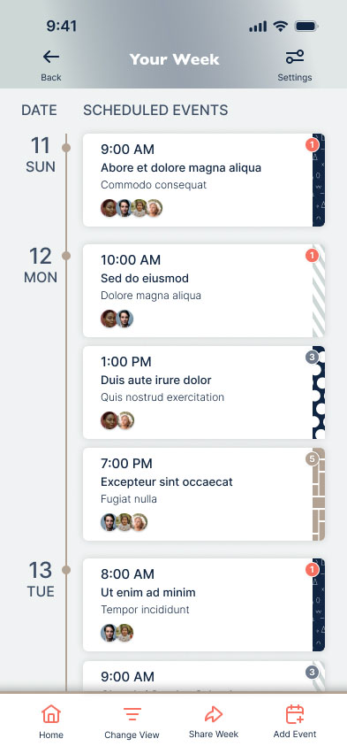
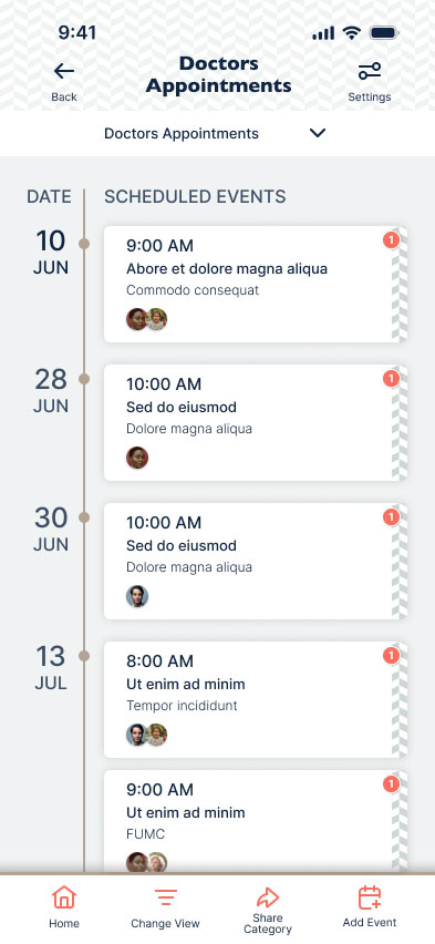
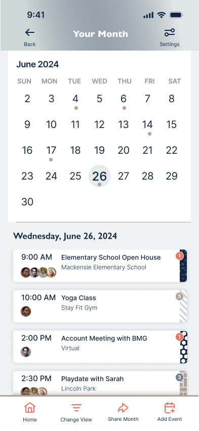
You can see at the end of the prototype walkthrough video that there is not a way to navigate home from the single event screen. This requires additional iteration.
High-fidelity Prototype
Below is the prototype flow.
More Usability Testing
A theme emerged during usability testing for the high-fidelity prototype in which users would only use the ”Find Free Time” button to add events rather than the navigation button. Adding in a second CTA button on the home page gave them a choice on how to create their event.
— reflect —
Impact
One participant said: “This app is good idea and is easy to navigate.”
This project was a contributing factor in completing my Google/Coursera Professional Certification. The impact to date has been entirely personal in that it has not been developed.
What I learned
At this time, my strength is in visual design, while my user research and testing skills could do with some practice. Testing early and often will save you work in the long term.
If this were a real life product, this process would have benefitted from real user research and testing with participants who fit the target audience.
To make the minimum viable product, the initial designs could have been simplified further.
There are lots of opportunities to add functionality and delight to a product such as this, including an onboarding flow, gamification, and voice commands.
What's on your mind?
Improve this site:
Share your experience as you interacted with this site.
Your feedback is critical to making impactful changes.
Collaborate:
New challenges welcome!
Tell me about how you want to work together.
